Novelties always bring me joy and sometimes include a twist of the head to confirm what I thought I saw I actually did see. This is how I felt when I encountered a self-serve café in the middle of a series of exhibit galleries - and I don’t mean off to the side in an adjunct space. One exited a gallery space ready to enter another gallery space ( what one had already done several times before) when one suddenly was faced with an area of tables and chairs along with a barista -café like long counter table. This was set up so one could fix oneself hot beverages before choosing a seat. Around the space, this city museum of Salzburg had a smattering of wall displays about the Taste of Salzburg to reinforce the universal human hunger connection with the sense of place.

Salzburg City Museum self-serve cafe Courtesy Bill Reynolds
Even better one could have it set up as a place to reflect on what had come before in the exhibits that the visitors had just travelled through. Question cards on the tables could stimulate conversation as in “What did you think about…” or could pose as stimulants for what one may have missed as in “Did you see the… (it was hiding in the corner hanging from the ceiling)”.
If I recollect correctly, there was an option to go outside into a small courtyard. Using indoor/outdoor space juxtaposition can be effective to break up the instructional atmosphere and literally provide a breath of fresh air. Can you see a way of doing that at your site?
Why do we often only have a cafeteria of a large scale sequestered away down a hallway or in a back corner? Why not offer in addition, a smaller space interspersed with the learning or experiential environment as this example demonstrates? Provide simply a place to gather over a beverage and maybe enjoy a self-dispensing snack from a vending machine, but make sure it is an attractive place and not in a corridor. You can use the existing traffic flow but you need to create a SPACE to linger as in stools at a counter. Check out new health clinics and recently built academic campus buildings and you should see this in action. I certainly have. Investigating places involved in the field of well being like we are, in the interpretive profession, are worth observing to see how they handle the visitor experience.
Lo and behold I experienced this rest stop concept in the midst of wandering through galleries again- this time at the Museum of Glass in Passau, Germany. It felt like a mini-exhibit all on its own in keeping with the era of time being represented. What a gorgeous space. It was devoid of any interpretation - pity. It did not include any glass replicas. Opportunities lost.

Period rest area, Passau Museum of Glass Courtesy : Bill Reynolds
Now a word from our self-serving sponsor -ourselves, as a matter of fact. When we at EID review the visitor experience, we consider not only the mindset of the visitors but also their “bodyset” so that they are in an enjoyable state to fully absorb where they are at. Intellectual, physical, and social comfort is what we strive to capture. We want the visitor to maintain their entrance energy and enhance their dance when they visit heritage spaces.
This is why we emphasize the point that interpretive designers need to be involved upfront when interpretive spaces are being set up. It is not as easy when you have a space already, however we can coach you to reassess the existing situation and come up with ways to reconfigure for maximum impact. Contact us.
Cafe sneak peek Courtesy: Bill Reynolds
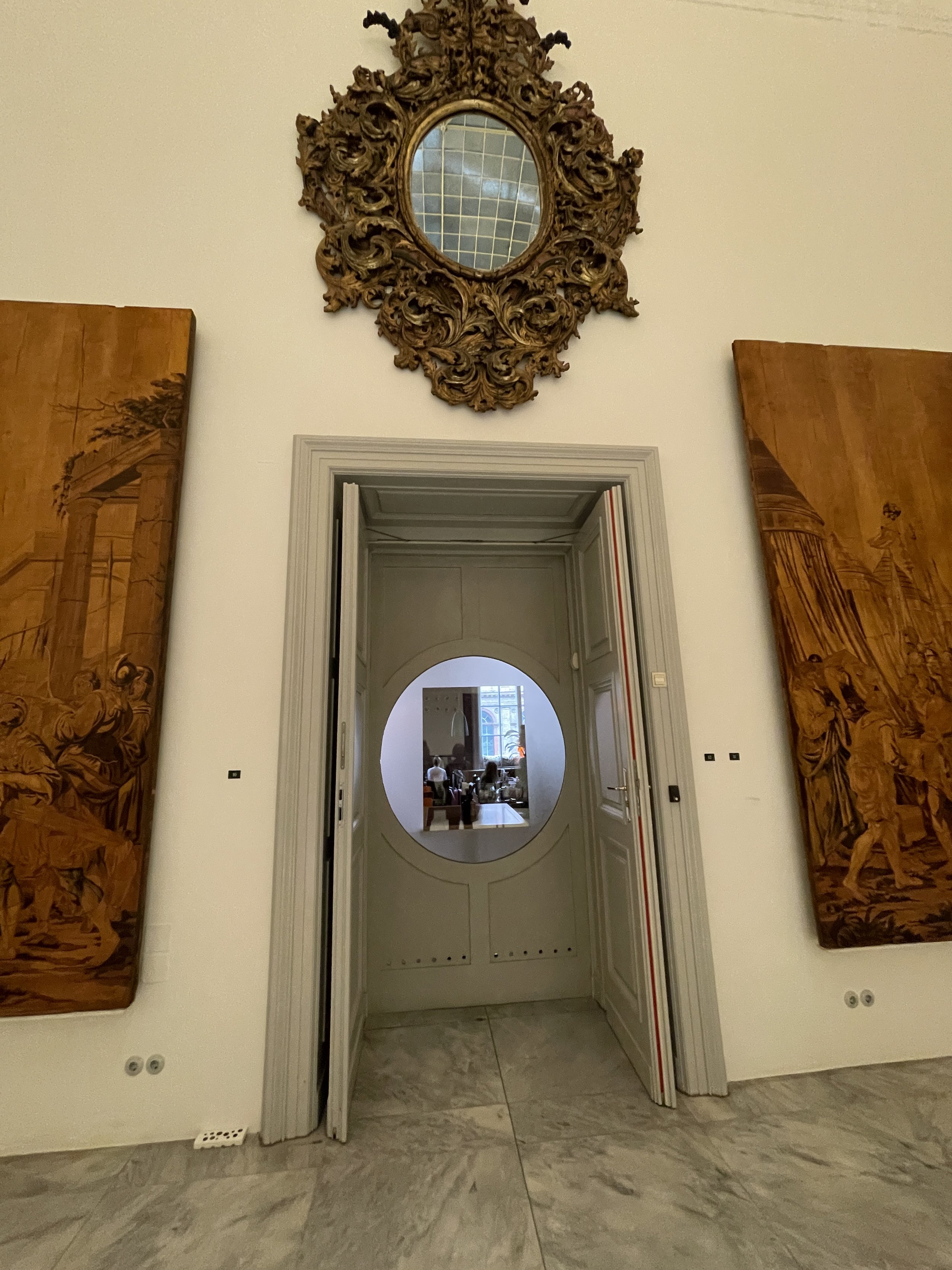
Although primarily acting as a marketing tool for a hidden away café, a “window’” technique can play multiple roles, firstly for example to provide an outlet for visitors to satisfy their physiological need of hunger and thirst. Have a viewing window right in the middle of the exhibit gallery wall (or as in the example shown, use a door in the middle of the wall) affording the visitor a sneak peek into the restaurant. Even better tantalize the visitors with a close-up of an array of delectable wares to stimulate the salivary glands.

Cafe pastry culture Courtesy: Bill Reynolds
This porthole preview concept can be applied In interpretive ways to stimulate visitor curiosity with a focused exhibit lookahead. Or in the case of a nature centre, portholes at different levels could provide views outside enticing exploration of specific concepts like interrelationships being spotlighted. Or in the case of an historic site visitor centre a glimpse of the start of a self-guiding trailhead could be the directed point of view. Or a multilayer building could make use of a periscope or subscope. Literally, as interpreters, we offer “windows on the world,“ and we need to grab many more opportunities to “frame” the experiential invitations we are setting up for our visitors.

Children’s gallery floor level entrance Courtesy: Bill Reynolds
One more example of using portholes to discovery was a floor-level passageway in a gallery in order to access a children’s exhibit corner. Brilliant concept.
Food and beverage breaks are one avenue to counteract “museum fatigue.” We all know we could do better. Various after thought attempts at providing benches (often hard and uncomfortable with no back) or the odd chair are not proper solutions. A previous blog post, Antidotes for Visitor Fatigue Syndrome Part 1 and 2 Part 1: Antidotes for Visitor Fatigue Syndrome — EID Coaching showed some solutions.
Staying on the rest concept, I was struck this trip by the lobby in Vienna’s Museum of Applied Art & Design, upon seeing the large overstuffed sofas ringing the outer walls of the atrium.

MAK Museum of Applied Art and Design lobby Courtesy: Bill Reynolds
They were funky and well-utilized by patrons, appealing to all ages I had to wait awhile to capture the sofa image with only one individual-usually family or school group hangout). Let’s get over the fallback position to use “standard institutional issue” furniture. Unless we are trying to impart an interpretive message of austere incarceration or some such.
This museum was a treasure trove- one example that happens to blend well with sitting, exhibitry and applied design was their decision to display the evolution of chair design through silhouetting. My photos I hope illustrate what they achieved through white sheeting, lighting and the creation of three long parallel corridors. Subtleties of design were definitely enhanced by focusing on the shadow world !

Clever silhouetting, MAK Courtesy: Bill Reynolds

MAK front /back shadow catching technique Courtesy: Bill Reynolds
Transferring this idea into a natural heritage encounter, I was reminded of a wonderful sensory activity called Share a Shadow from the Earthwalks: an alternative nature experience book produced through the Institute for Earth Education. Participants all have shadow catchers to capture immediate impressions that are delightful dimensions of a sunny day. Then they all create a gallery of sorts in the woods, prairie, desert -you name the habitat. It is a great way to reinforce how the earth is turning.
Do you see any applications for this technique at your site? Please let us know. If you desire a creative idea-bouncing zoom session on enhancing the visitor experience at your site, get in touch with us.