November’s blogs contained some heavy cerebral planning material, so we thought you might want a lighter fare as we enter the holiday season. Here is a gift collection of interpretive design tidbits that caught my eye this past summer season. I wrap up the post with a New Year wish to be sent out into the multiverse so it spreads as far and as wide as possible. Feedback requested.
Note: All Photos were taken by Bill Reynolds unless captioned
Balancing needs
What should the first sign as you enter a site deal with? Here is a wonderful example of an approach that works. The three headings that greet the visitor reflect a balance of catering to the visitor and catering to the site management. What will you see? What lives here? What makes this site unique?
The first two questions address orientation style inquiries that are very commonly asked by visitors so why not talk to your prospective visitor right off the bat responding to what is on their mind. The third question is tied to the mission of the site. Visitors should become aware of what makes this site different and worth protecting. In this case, visitors discover they will be walking among three different and rare unburned relic forests. What a tree-mendous entry sign to a natural area.

In contrast this entry sign to a wildlife reserve, suffers from the old problem of cramming too much onto one sign compounded with a confusing mosaic treatment and colour scheme. The information package is a mix of really need to know and nice to know topics splayed out like a puzzle. The first two questions of the previous sign are sort of handled here but buried. The main concern is a site protection one dealing with impressing on the visitor that they should stay on the trail – read the red top triangle. I fear due to information overload this critical message is not read by everybody.


The message in the red triangle probably should have been a standalone sign potentially using a bold black on yellow cautionary sign quality.
The exclamation point in the middle of the sign may have caught your eye. It is attached to some significant information about species at risk in this area but a dull listing of the 12 species names is a let down for the visitor. Images would have been so much more effective. If cost dictated one sign then message priority should have stepped in and the two areas being discussed should have won out.
Nail down your objective
Now we are talking – giving the visitor something to do and engaging with the visitor’s senses but is this well done or poorly done? What was the objective? Did they go far enough by simply asking a question? That is the usual problem- often times you are asked a question then not provided with enough background to take it any further.
In the avian case are they assuming (often a bad decision based on the writer’s knowledge) that you know what a mallard quack and a goose honk sound like but perhaps not what a “call” of a trumpeter swan is like? Does it sound like a trumpet and is that what the reserve managers want the visitor to listen for? Do they want the visitor to see if they can detect at least a certain number of waterfowl sounds so they get a sense of their diversity in the wetlands? You are left on a precipice of involvement- especially with no audio component associated with the sign.
In the mammal case, they give you three options and show you a photo of only one? Without binoculars from this point, the animals are specks so you would not be able to detect which one anyways? What was the point? If you wanted to assist visitors in discerning the fact that these three furbearing water-loving animals live waaay down there, would you not have been better off showing images of each animal:
· swimming in the water indicating how to tell them apart and/or
· indicating with arrows that point to the parts of their bodies that you use to identify them when visible out of the water?

Writing for the Visitor
How do these interpreters treat a trailhead welcome? Another use of the old question strategy, and in this case it relates to having listened to the visitor and noting where they are coming from. When it comes to GIANT TREES people want to know their age. Instead of just putting up the dates and an associated historical event, the writer went the extra mile of visual imagery engagement. Relating branch growth to a human life that the visitor could touch would really drive it home. Connecting this to sustainable certified logging practices and wood purchasing decisions would extend the teachable moment relevance to human lives.
Were you intrigued by the orange lettering at the bottom of the sign image. It was a clever promotion for park pass purchases. The main point, is the missed opportunity I frequently encounter where cross promotion of other trails or programmes is rarely utilized. A visitor experience interpretive plan needs to consider how to raise visitor awareness of park offerings and encourage visitors to linger longer.

That question strategy again – is it relevant? Not knowing how loud a frog’s voice is -doesn’t that keep you up at night? Large colourful graphics are so commanding of attention. It seems like the small text real estate is being vastly underutilized. This is great cocktail party information but what purpose does it serve?
A positive aspect is how they handled the distance -rather than just stating it numerically, the text grounds you to the present by referring to an object (the resort) that you not only can still see from this location but it is also where the trailhead started from.


This management component of a sign (left) was also seen at the entrance point to a forest trail. Taking a light tone yet still delivering a strong message. Taking the time to communicate potential impacts and explaining the rationale for requested visitor behaviour. Do these strategies work? Do you attract more flies to honey than vinegar? Does this help parents explain to their children certain needed rules in high traffic areas? Master’s thesis anyone?
An interpretive sign glimpsed in a kid’s bike park that speaks so well to starting where your learners are. Having the look and feel of a kid’s book it also focuses on subject matter that appeals to their age group - licking a slug and poop. Will this encourage kids to approach these forest animals in an investigatory and caring way, as opposed to stepping on them? Does it supply enough NEAT factor to get kids to appreciate its existence?
Diversity and Inclusion Firsthand

If your objective is to alert the visitor to the wide range of plants growing in a small space then this layout accomplishes that. The array of species on the perimeter are connected to the central photograph using white dotted lines (hard to see in photo but clear in real life) so it is easy to make the link. At the same time, what percentage of visitors like counting the number of plants they see? Perhaps the goal was just to encourage visitors to slow down and look more carefully on the ground. This sign might need some more hints to direct kneedrop behaviour and micro-trailing to allow the practicing of close-up skills.
Larger Than Life

Here is a clever way to share the impact of a dam and make it approachable from an invertebrate perspective that is also relatable to a human experience. This writing style captures you right away and it places you in the centre of the action. The larger-than -life image draws you in. The content is very dramatic and pertinent as it relates to the impact of a dam on these little fresh water fellows. This deals with a daily happening that most visitors would never think about. You can almost hear readers saying, “I had no idea…”

Great example of design that reinforces the message Bugs for Breakfast where the background is a red checkered tablecloth and plates. Zoom in and you’ll see each invertebrate has a size reference beside the larger-than-life drawings. So many times this little detail is forgotten and people go away with no concept of how tiny these creatures are. What is missing here?
There is plenty of reading but no call to action – no exploratory doing suggested. Was there a place close by where the passerby could get engaged? Could you have promoted a regular program, the visitor centre aquaria or a kit to borrow focused on pond life?
Exhibit Dynamism

How about a wayside exhibit you can actually step into? How do you give visitors the sense of ski-jumping at an heritage ski hill where world records were set? Like a tandem skydive where you are strapped to your instructor, these interpreters envisioned a sculpted metal figure that visitors would literally lean into while standing on a set of skies and looking dooown. A very gutsy move.

Even the picnic table infrastructure reinforces the essence of the site. You may be familiar with actual skiis being used as seats and snowboards as seat backs in other ski-related locations. This treatment breaks the stale mold of same-old.
How about a twist on the standard mounted flat interp signage? At the same ski hill wayside exhibit this twist was presented like a wide “V” similar to an old-style flipped open newspaper - laid out with snippets of articles & ads.

Another clever addition was the English title Face Plant Daily which I assumed was made up and not the actual title of the local paper of the time period. You should always be on the lookout for catchy quirky titles. The writer may have borrowed the idea from the local accommodation in town -Face Plant B&B. The French Title translates as the Snow Bulletin – falls flat for me - missed opportunity to help the reading visitor to have some fun.
Let Interpretive staff be creative

Are any of your sites using new methods of communication due to line-ups caused by social distancing? If not, you are missing an interpretive opportunity. Sure, you can put a line on the floor to designate the six feet separation but how creative is that? In this case, the owner capitalized on social media testimonials as a marketing gimmick to draw you in and confirm you have made the right choice to visit. Your site could do the same and/or incorporate an interpretive message. Never underestimate what you can learn standing in a cafe line!

Seen on a road at a outdoor camp setting where a trail crossing occurs:
What if cautionary/warning signage could be original and aspirational at the same time yet still be effective? In this case you want to slow drivers down and also give them something to think about. Bonus, campers feel pretty good about their future self too. Whereever you need to communicate with visitors, let interpretive staff be creative.
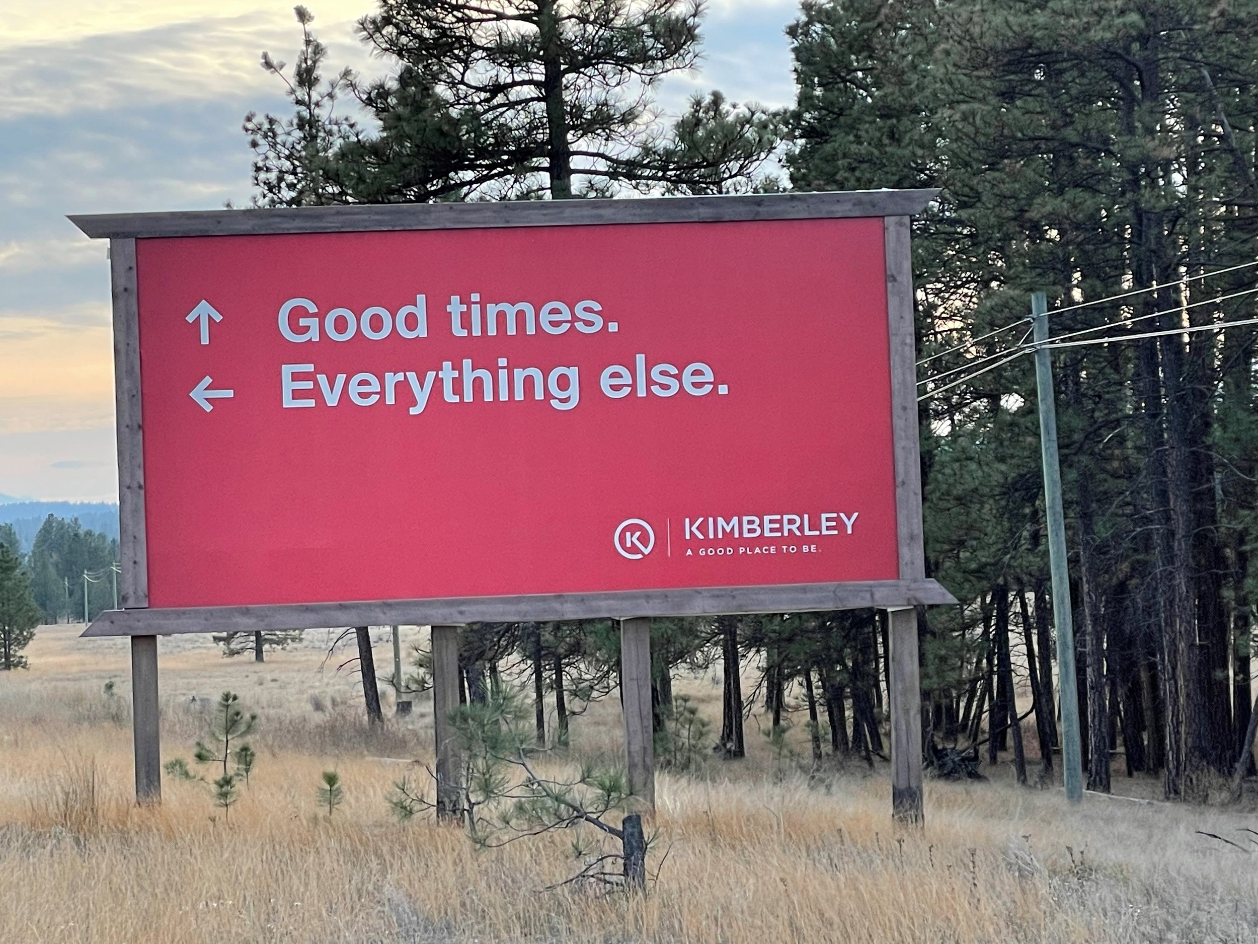
Love this non-traditional directional sign positioned at a T-intersection. Big and Bold and easy to read plus makes you ponder and packs a chuckle punch. If you are going straight ahead anyways you get a confirmation that you are heading to good times (the town of Kimberley). If you were planning to turn left then you have a seed planted about Kimberley and perhaps you are missing out on something- good times. Can you see how this can be applied not only during the arrival stage of your visitor’s journey but how this technique can be used on-site at trail intersections, in lobbies or hallways? Let interpreters be creative!

Contracting street-artists may pay you back many times over if you simply provide them with the interpretive essence and primary message of your site, letting them create a stunning visual. What word caption or phrase comes to your mind when you encounter this? For me, it is nurturing.
Let us know what your caption might be so we can share -there may be a prize awarded, you never know.