As the holiday season where presents are exchanged is winding down we felt it only appropriate to provide our readers with a gift to take forward into 2020 - one we feel visitors could use more of - the gift of humour.

Photo Credit: Bill Reynolds

Photo Credit: Bill Reynolds
First Impressions
From the parking lot to the entry door, first impressions set the stage for the rest of the visit. This parking sign is trying to not only designate where to park but add a little humour to the first conversation with the visitors when they arrive. Does this accomplish an informal tone? Did this generate a chuckle or at least a smile? Does this capture the attitude the site wants to portray?
One cautionary note: Humourous parking signage may not always have the right effect if there is the potential of setting up a “we-they” situation with wine lovers and others. Is everybody receiving a welcoming feeling? Along with humour it is also good to avoid the possibility of alienating anybody.
Let’s look at the example of the We’re Open and We’re Awesome sign at the top of the page. Is this an invitation to enter or what? Do you expect the greet staff to be OPEN and approachable? I sure do! Did this generate a chuckle and maybe a smile? Is this the attitude we want? As the old saying goes, we will attract an audience much better with honey than with vinegar.
Credit: Bill Reynolds
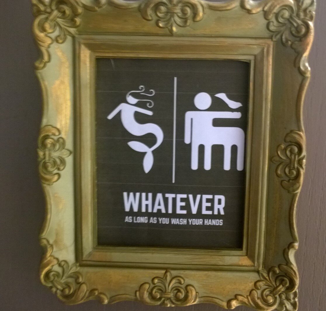
Washrooms are often a key element of first impressions. This washroom identification sign, WHATEVER as long as you wash your hands, keeps up with the times - and uses a little left brain thinking. Novelty increases receptiveness. We want our visitors in a light-hearted mood ready to be mentally and emotionally engaged – so let’s design for it - let’s get a laugh! Men and women washroom signs can be so boring – but centaurs and mermaids - now we’re talking.
Interpretive design aims for joy.
Directional signs — Who said directions can’t be fun? How different is the use of a colourful comic approach? This agricultural washroom theme works on a family-oriented agricultural tourism operation as integral to an “edutaining” on-farm experience. Cartooning, an underappreciated and fast becoming a lost artform, is a great way to highlight directions. In the case where children form a major portion of your visiting public how about appealing to their sensitivities by using a children’s illustrator or having children/youth provide input to the design? Smiles increase receptiveness. Why not slide in a chuckle here and there.

Photo Credit: Bill Reynolds

Photo Credit: Bill Reynolds
An exhibit called Wise Quacks at the Oak Hammock Nature Centre in Manitoba, Canada was based on children supplying bird related jokes for a display as if actual birds were talking to each other. This provided a different entry point for the non-birder to be exposed to the vast array of bird diversity, rather than simply looking at cases of labelled stuffed specimens.
Using a joke and catchy image as an entry point was seen at a u-pick garden in order to draw attention to a text sign with fun facts about different crops. The reader was asked, “What does a vegetable wear to the beach?” A ZUCCHINI. Then they followed up with 4 quick points they felt the visitor could relate to and would be interesting.

Photo Credit: Bill Reynolds (Honest Box Farm)

Photo Credit: Bill Reynolds
If you are a nature centre, and you have a food and beverage facility why not be creative with your menu and use an animal motif to “espresso” yourself!

Photo Credit : Bill Reynolds (PASU Farm Boutique)
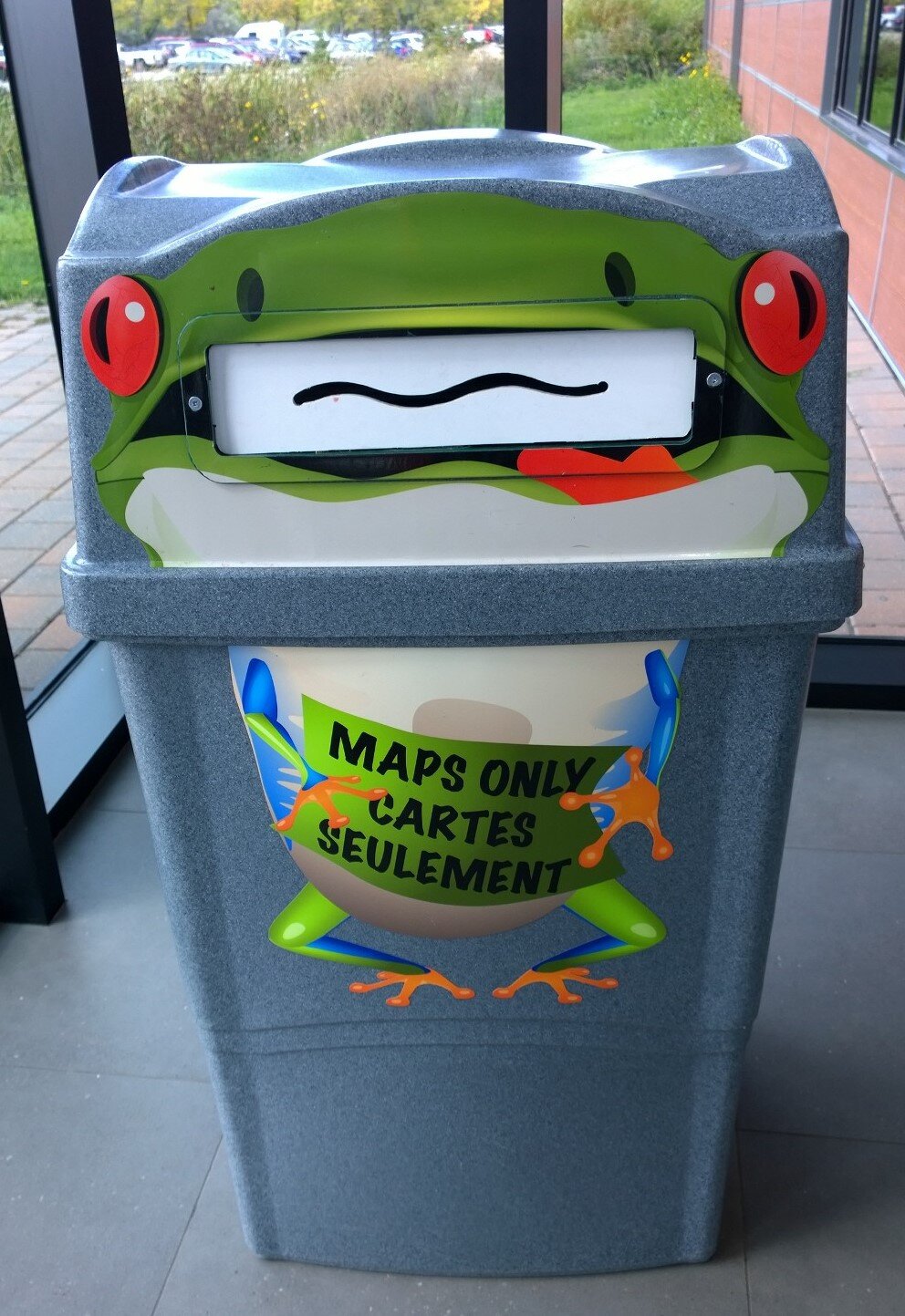
Photo credit: Bill Reynolds (Winnipeg Zoo)
Or how about some watering humour at a botanic garden…
And encouraging brochure recycling at the end of the visit like this funny focal point of a frog waste receptacle.
Interpretive design aims to increase visitor receptiveness.
Getting your visitor in the right frame of mind to engage with your site needs creativity and a certain playfulness as evidenced at the Coffee Science Centre in Campo Maior, Portugal where they employed tilted giant coffee cups as “signage panels.”

Photo credit: Bill Reynolds

Photo credit: Bill Reynolds
Sometimes it is the object on display that embodies novelty and humour. I found this wall mounted, double black and white square artform in the contemporary art gallery known as the Berardo Collection Museum in Lisbon, Portugal. The sentence being shared on the canvas reads: “The content of this painting is invisible; the character and dimension of the content are to be kept permanently secret, known only to the artist.” First, it worked to make me laugh, next it made me ponder the commentary, and then I realized the point of taking ourselves too seriously and it might be worth poking fun at oneself every so often.
Receptiveness can also be tied to site management. How often have you seen formally written, non-graphically oriented signage informing the visitor in cold, bold typeface about something being closed, out of order or a possible delay? Well, here is the opposite way of expressing to your visitor/customer that a possible wait time annoyance may occur, in this case, because staff are being trained.

Photo Credit: Bill Reynolds

Photo Credit: Bill Reynolds
This ingenious cat and mouse graphic at the corner base of a wall of a staid municipal building indicated that someone who had a sense of humour was permitted to use it to lighten the load for pedestrians. Imagine if you encountered a humourous style of artwork in a non-prominent location — like at the base of a bench on your way from the site’s parking lot to the entrance. Would this serendipitous graffiti put a lift in your gait and encourage you to be investigatively looking around? This should be encouraged judiciously along our exterior pathways, on the corner walls of our interpretive institutions and even within the interior hallowed halls of museums.
If you have a good example of humour and lightheartedness, please share them with us in the comment section or send us a separate email. Who knows, we may use your humour in future blog posts or start a regular humour section on the website.